
There are thousands of sports uniforms throughout history, most do their job of providing the team with an identity that fans can rally around and more importantly, a color scheme and logo that management can use to sell merchandise. Every now and then, however, the uniform designers fall short...or trip on acid, either way. Saturday on Vertically Striped Radio, we broke down the Top Seven ridiculous uniforms from professional sports. Here is a list of some of the most glorious departures from the uniform norm.
Honorable Mentions:
Green Bay Packers Throwbacks for the upcoming season: Yes, the Packers are actually going to wear these on the field. I'm reserving judgment, as they might look kind of cool on the field, but brown helmets to replicate leather helmets? Yikes.

Montreal Canadiens Throwbacks from last year: When I see these, the first thing I think is PAJAMA PARTY!!

Saint Louis Blues Alternate (1996-97): The Blues are saved from being on the list by the fact that common sense prevailed and they made like Nancy Reagan and "Just Said No" to these atrocities. Frightening how close these were to actually making the ice.

The Magnificent Seven:
7. San Diego Padres - Camouflage Uniforms: Okay, I get that there is a huge military presence in San Diego, and the Padres will do anything to try to attract fans to the stadium, but Camo should only be worn if there is a chance that you will either be firing a gun or having a gun fired upon you. Nice to see that the Padres are prepared for either desert or forest combat, though.


6. The Mighty Ducks of Anaheim - Alternate (1995-96): With a logo straight out of Saturday morning cartoons, the team that already faced the handicap of being labeled "The Mighty Ducks" had even more wrong with them as they took the ice in these atrocities. Yes, that is the actual logo.


5. Seattle Seahawks - Radioactive Snot Green Jerseys (2009): When Aquaman gets the ich, this is the color of his snot. Also, it was briefly the main color of the Seattle Seahawks. Fortunately, the Hawks have decided to "retire" this jersey, worn only one time last season against the Chicago Bears in what very well may have been the biggest clash of classy versus unclassy uniforms in the history of time.


4. Chicago White Sox in Shorts (August 8th, 1976): In the hundred and forty or so year of Major League history, baseball players have worn shorts exactly one day. August 8th, 1976. I think there is an exceptionally valid reason we haven't seen it more often.


3. Washington Wizards - Alternate: Contrasting pants and shirts look fine in many sports...Basketball is not one of them. Making this even worse is the faint gold color the Wizards went with. All of the uniforms on this list are goofy, but doesn't mean I dislike them all. However, these uniforms are perhaps my least favorite sports uniform of all time. I'm not sure I could design a worse uniform if you gave me a six figure budget and allowed the color pink to be involved.


2. Vancouver Canucks (1975-1982): So I understand that the Seventies were a different time, but how does this design get off the designer's drawing board and get the green light in any time period? I shudder to think that some version of this conversation took place, "Hey, V necks are hot right now, our team's city starts with V, let's work with that." Even worse, though, that color scheme and uniform replaced one of the best uniforms in sports, the green and blue colors with the Hockey Stick "C" logo. Shameful.


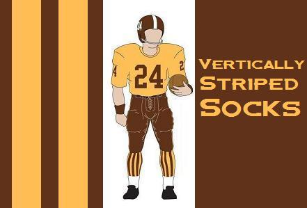
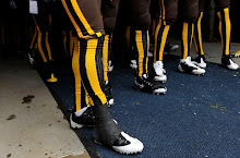
1. Denver Broncos - Vertically Striped Socks (1960-61 and 2009): Yes, I have based my entire web presence on this uniform, but that doesn't blind me to the fact that they are pretty insanely goofy uniforms. I love them despite their ugliness, not because I am blind to the fact that they are in fact ugly. As much as I love them, the fact remains that they were bought second hand by the Broncos first owner from a defunct college Bowl game, and that after only 2 years, the socks were burned in effigy at a public bonfire due to the hatred the city had for them. How many uniforms are so hated that they get their own public bonfire? My beloved Broncos and their Vertically Striped Socks have clearly earned their top billing.


2 comments:
No mention of the New York Islanders "Gorton's Fisherman" jersey?!?
Oddly enough, I like the Fisherman jersey/logo.
Post a Comment