
The Philadelphia 76ers announced Tuesday that they will be going back to their roots, at least aesthetically. They are dropping the solid but unspectacular Silver, Gold, Black, Red and Blue Logo that they have used for the past decade and gloriously replacing it with the previous logo that they used from 1963 to 1998. This previous logo is a beautiful red, white, and blue and was in place when they won their two titles in 1967 and 1983. I would like to applaud the Philly NBA brain trust who realized that the best way to go with a historic team like the Sixers is to embrace the past and attempt to return to their previous glory. If you’re named after the year the Declaration of Independence was signed, you really need to embrace patriotic colors, plus the old logo is awesome.
This is a trend I can definitely support! With retro sports stuff selling so well, I can definitely see more teams ditching their modern getups for more beautiful items from their past. Prior to the Sixers making this move, we have seen glimpses of this glorious line of thought with the Giants returning to their beautiful NY logo, the Jets going back to their Namath era unis, the New York Islanders ditching the Gorton’s fisherman for their much better and classic logo, the 49ers going back to cherry red, and the Capitals ditching the weird eagle logo and going back to basics. However, this trend can go further, and here are some franchises that are practically screaming for a touch of the past…
Atlanta Falcons: I would keep the Falcons current logo in place as I like it much better than their old one, but I’d make their helmets red again like they were in the days before Jerry Glanville.
Buffalo Bills: They need to permanently embrace the royal blue uniforms with the white helmets that feature the standing buffalo. They have been sporting these on occasion of late, and they should make the change permanent or at least go back to the Jim Kelly era uniforms, as the hideous things they wear now are embarrassing.
Buffalo Sabres: Ditch the Buffaslug posthaste and go back to their beautiful crossed swords logo with the leaping buffalo above it. That is one of the most handsome unis in sports history, and it’s a shame they ever ditched it.

Carolina Hurricanes: This goes beyond just the uniform, as they need to move back to Connecticut and then quickly get back into those beautiful Whalers jerseys. That is one of my favorite uniform and logo combinations of all time.

Cincinnati Bengals: They should drop their hideous new uniforms and return to the Boomer Esiason era jerseys. It’s not that those uniforms were all that great, but the threads they sport now are an abomination.
Houston Texans: It’s not like the Texans have a whole lot of history or an exciting uniform, so I suggest they change their name to the Oilers, don the powder blue jerseys and the oil derrick. Warren Moon and Earl Campbell really made those things work, and the name Oilers is much better for Houston than the generic and stupid name of “Texans”.
Milwaukee Brewers: Duh, the wonderful ball and glove logo should again become their daily uniform, as it is vastly superior to the rather bland getup they currently wear.
New England Patriots: They must return to their Pat the Patriot helmet and those glorious red jerseys. Those uniforms are so much better than the Flying Elvis logo, I can’t even begin to express how much nicer they would look on the field. However, since they’ve won three Super Bowls in their new threads, I imagine this won’t happen.

New York Mets: The Metropolitans should really remove all traces of black from their uniform and go back to the pinstripes they were wearing in ’86 when they were one of the most interesting teams of all time.
Philadelphia Eagles: I’d do a subtle change here. Keep the current helmet pattern, but go back to their brighter green color and ditch that ugly dark brooding green.
Seattle Seahawks: I don’t hate their new uniforms as much as many people do. I feel that they should keep their current logo, but make their helmets silver again and their jerseys the beautiful bright blue and green colors from the past.
St. Louis Rams: They should definitely and immediately go back to the blue and yellow they won the Super Bowl with. Those colors were beautiful on the field.
Toronto Blue Jays: I would love them to go back to their awesome uniforms from their World Series winning days of the early nineties. Joe Carter looked great trotting around the bases after taking Mitch Williams yard to win it all.
Vancouver Canucks: They need to embrace their blue and green uniform set with the stylized C logo. Ditch the Orca already.

Washington Wizards: They should embrace their Bullets past, ditch the dumb name and go back to the basic red uniforms. (Although definitely not the weird horizontally striped ones or the crazy ones with stars everywhere, ugh)

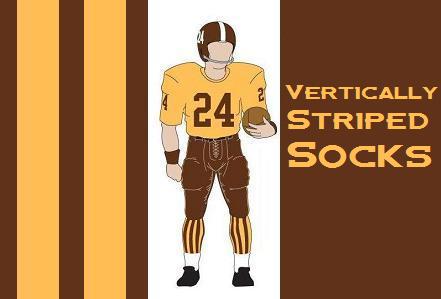
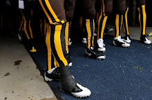
Of course, there are also exceptions to this retro trend. One team that should never under any circumstance make a permanent return to its old uniform would be the Tampa Bay Buccaneers. I am pleased that they are going to wear their creamsicle uniforms on November 8th against the Packers, because it serves as a reminder of one of the uglier uniforms in league history, and I have do have a soft spot in my heart for teams wearing ugly retro uniforms for a game or two (Obvious example: The Broncos Vertically Striped Socks uniform), but under no circumstances should the Bucs entertain the notion of permanently returning to the Bucco Bruce uniform set. Butterscotch pudding is very tasty, but the color makes for a lousy uniform.


3 comments:
The Whalers uniforms are beautiful, I agree. But that's the one and only thing that was better about the Whalers. Move the team back to Connecticut? Why? Because the NHL needs another uncompetitive, poorly attended, financially unsuccessful team??? The haze of time makes it easy to look back fondly on the Whale. Unfortunately the actual facts don't support most of those wonderful "memories" people have about that organization.
Now back to the uniforms: personally I'd love to see the Hurricanes go back to the Whalers colours! They actually suit a hurricane perfectly. Since that's highly unlikely, it would be nice to see an element of the Whalers unis somehow incorporated into the Canes design.
The haze of time may make things seem better than they were, I'll acknowledge that, but does North Carolina really need/want a hockey team?
If North Carolina needs a hockey team, I don't understand why it isn't in Charlotte. Raleigh is home to the Hurricanes, but also to the NC State Wolfpack, and Durham and Chapel Hill aren't too far away with the Duke Blue Devils and North Carolina Tar Heels, respectively. It is pretty baffling that the Triangle has a pro hockey team when college athletics (or maybe even just college hoops) is the main sports fix in the region.
Post a Comment